
The useful question is not how much wording can fit. It is what a customer must understand first, from the distance and speed at which the graphic will actually be seen.
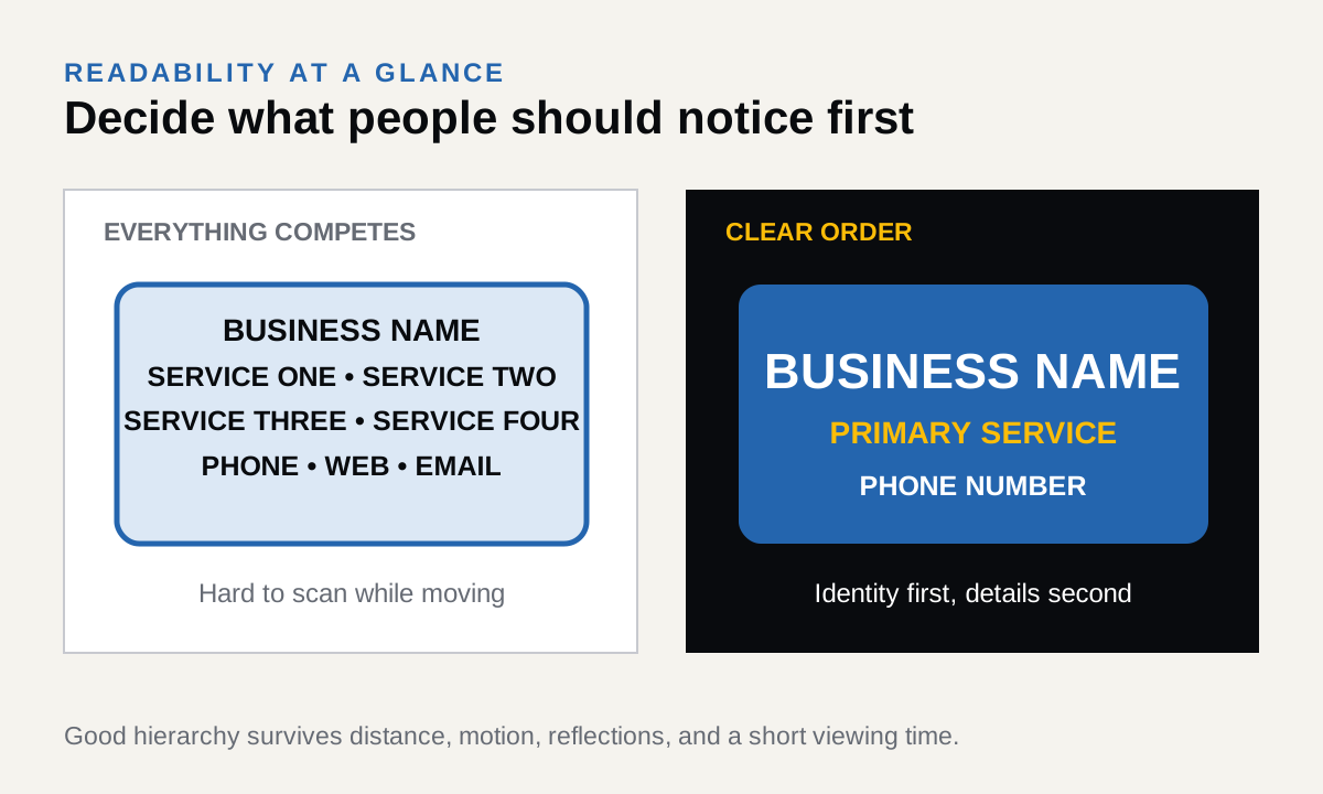
Create a hierarchy
Business identity or primary service should lead. Supporting information can follow. When everything is the same size, nothing is clearly first.
Contrast matters
Letter color, background color, shadows, outlines, reflections, and lighting all affect readability. A visually interesting combination is not always a readable one.
Design for the real viewing condition
A storefront is read from a sidewalk or road. A truck is often moving. A wall logo may be seen from a reception desk. Scale and detail should respond to that condition.
The right material and production method depend on the surface, location, size, expected life, and installation conditions.